If this book were being written seventy years ago, we would speak of two 1861 issues, the Premier or August issue (for the month they supposedly came out, one month before the regular issue), and the Regular issue, which was issued in September of 1861. the Augusts, as they most usually were called, have very slight design differences from the issued stamps. It is now known beyond ay reasonable doubt that they are not stamps at all, but rather essay submitted by the National Bank Note Company to the United States Post Office. As part of bids, companies were required to submit essays of what they proposed the new stamps should look like. Such a stipulation had been a requirement of contract bidding in the past, and the Post Office Department usually mandated rather significant changes in the designs of the stamps. But stamps were needed quickly now that the Civil War had started, and changes took time. With the most minor changes, the post office ordered the essays virtually as submitted.

 The National Bank Note’s essays (hereafter called the August issue as they are listed in the catalogue) have 1 cent, 3 cents, 5 cents, 10 cents, 12 cents, 24 cents, 30 cents, and 90 cent values. All were printed on a very thin, hard, brittle paper. The paper damages easily, and for this reason many of the Augusts were damaged even though they were placed in philatelic hands from the earliest time. These stamps are listed n Scott as #55-62, with #58 being issued later to the public. When the #58 has been used, it is listed as #62B. With this sole exception, none of the other Augusts were generally issued to the public. With the exception of unused 3-cent and used 10-cent values, all of the Augusts are rare with less than a dozen sets existing. Though they were not originally postage stamps, they are listed that way in the catalogue and are great rarities.
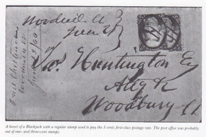
The real 1861 issue (#63-78) is the earliest United States set generally accessible to the philatelist. The stamps were issued between 1861 and 1866. Most of them sell used for under $20 to $25 each. The one-cent (#63) stamps is a beauty and was first issued, along with most of the rest of the set, about the middle of September. The two-cent (#73) stamp was not issued until July 1, 1863, and contains a large engraving of the face of Andre Jackson. The stamp is black; philatelists refer to it as the “Black-jack.” Two hundred and fifty million copies of this stamp were printed over its life, though well-centered examples are extremely rare—this may well be the most difficult United States stamp to find in well-centered condition. A perfectly centered two-cent Blackjack with large even margins sold years ago for 100 times the catalogue price, probably a record premium for quality alone.
 The most spectacular double transfer known on an American stamp is found on the Blackjack. Called the Atherton Shift, it represents a complete doubling o the entire upper left corner. The stamp is worth several thousand dollars, against a catalogue value for the regular stamp of only a little more than $10. The Atherton Shift was o doubt discovered by the issuing authorities early and the plate was either repaired or destroyed; otherwise it would not be so very rare. As it is, only three or four copies are known. The shift has not received much publicity outside the Blackjack specialist circles and indeed, until very recently, was not even listed in the general catalogues. An example could be sitting, undiscovered, in the most ordinary collection.
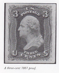
The three cent 1861 is known in a myriad of shades. The earliest printings are printed in a truly striking red shade called Pink by the c catalogues, but having a distinct tinge of blue in it. The Pinks (#64) are worth several hundred times the price of most of the other shades, which are much darker. If a panel of experts was asked to choose the one most common misidentification mistake made by novice, intermediate, and even advanced collectors, the overwhelming choice would be the confusion among the Pink (#64) the rose pink (#64b) and the reds (#65). All of the Pinks were printed with light-sensitive ink that darkens when exposed to light, destroying the variety. Besides hope springing eternal in the collector’s breast, and the widespread philatelist’s weakness for imagining his possessions to be more valuable than they really are, there is an additional factor at play here. For some reason that has never been addressed scientifically, the Pink’s color is a hard one to memorize. When the shade is pointed out to them, novice collectors will make the distinctions with aplomb, sorting out large quantities of the stamp with unerring accuracy. But in a week’s time, more often than not that same collector, if he has not worked on the stamp in the interim, will be back to making the same mistakes, confusing the shades and calling stamps Pink that do not even approach it. Several prominent collectors keep the several major shades of this stamp, including the Pink (#64) sorted and identified, and before they begin to work on quantities of the stamp, they review the shades again. Perhaps the human memory has a weakness over certain colors.