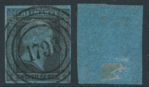
Philatelic colors often have a nomenclature that is unique to the philatelic field and often the term for shades varies from philatelic specialty to philatelic specialty depending on the whim (and translations from the early foreign catalogs) of the early Scott compilers. The color terms are usually consistent within each country-the dull red of the US #11 is consistent with the dull red of the Bank Note issues- but there is little match up of color terminology between countries. And some of the color terms don’t equate with what most people think of when they think of that color. The Pink of US Scott #64, for instance, in no way resembles the pink clothing that any of our wives have in their closets. And some of the color terms are just baffling. What is a Pigeon Blood Pink (US #64a) or the umber brown of the later Nineteenth Century issue of Newfoundland? The inexactness of color names even extends to areas where there is perfect scientific agreement on what the color looks like. Prussian Blue is a shade of blue that has a specific meaning in the world of color. It is made from iron and cyanide and extracting Prussian Blue from human tissue formed the earliest test to determine cyanide poisoning. But in philately, even a color with such a long and important history can mean various shades. The blue of the the paper of the early Prussian stamps are quite a bit lighter in shade than the famous France 2c Peace and Commerce issue Prussian Blue.


